The 2018 Apple iPad Pro (11-Inch) Review: Doubling Down On Performance
by Brett Howse & Andrei Frumusanu on December 4, 2018 10:00 AM ESTDesign
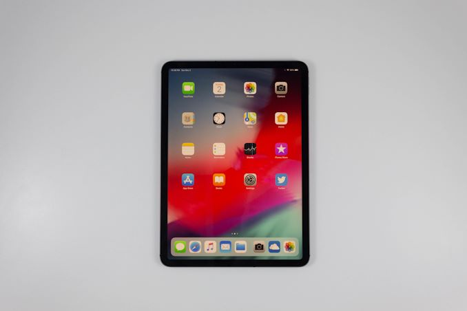
Arguably the largest change to the new iPad is in its design choices, and Apple has made some bold choices here which deviate significantly from the previous models. Apple calls the latest iPad Pro a “Window onto your work” and the company has taken design inspiration from its iPhone lineup with the reduction in the screen bezels to achieve this window onto your work.
The smaller bezels preclude the use of the Home button, which had already been deprecated in the iPhone, so it isn’t a surprise to see it removed here as well. The removal of the Home button also introduces the use of the same gesture based navigation already seen in the iPhone, except in a larger form factor. It also introduces Face ID to the iPad for the first time.
Due to the fact that the bezels required for a tablet are proportionally larger than a phone, there’s no need for a notch, and the Face ID camera sits almost hidden in the upper bezel. Unlike on the iPhone though, there’s no guaranteed way that you’ll be holding the iPad, and if you are holding it in landscape it can be very easy to have your hand over the camera. If that’s the case, iOS will let you know the camera is covered and show an on-screen arrow pointing to where it is. And, of course, the same caveats that go with any facial recognition system come into play with the iPad Pro. You have to be sure the camera can see you, so if the tablet is sitting on a table as you are using it, you may have to contort yourself slightly or pick it up if Face ID is required. It’s not quite as simple as Touch ID was, but it’s very quick and reliable.
If there is one major annoyance with Face ID on the iPad Pro it is the login process, which is overly cumbersome. Turning on the iPad will initiate a Face ID login, but Apple requires a swipe-up gesture to finish the unlock process. This is compounded on the iPad by the fact that the swipe must originate from below the bottom of the screen as if you were going to Home. Since your hand is likely not to be there, it is a less than ideal gesture for something that must be done so many times. If Apple just allowed the swipe up anywhere on the screen, it would be a big improvement.
Still, the removal of the Home button does make for a much more modern looking device, with the smaller bezels we have gotten used to over the last couple of years, and Apple continues its attention to detail by having the display corners match the radius of the device corners.
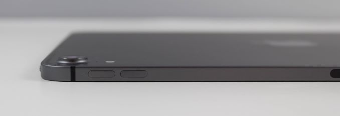
The other big design change with the iPad Pro is that Apple has moved to an almost-squared off edge, compared to the more rounded, tapered edges on the older models. This design change was almost certainly to facilitate the new Apple Pencil storage location, which has it magnetically attach to one side of the device. There’s a small RF transparent window there to allow the Apple Pencil to wirelessly charge when attached to the iPad, and a new pencil will sync with the iPad just by attaching it, which makes it a very seamless experience to get it up and running.
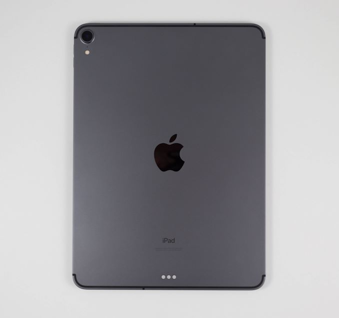
The squared off edges don’t provide the great in-hand feel of tapered edges though, but the iPad is thin enough that it is not a huge issue. It’ll also likely spend most of its life in a case, which is unfortunate since it is a great looking piece of technology. Apple has also done a great job of incorporating the various antennae into the design with symmetrical lines on the top and bottom which separate the metal at the top and bottom with the rest of the device.
Finally, Apple has continued its use of a quad-speaker arrangement on the iPad Pro, although with most things on the new iPad, they’ve been refreshed as well. There is now two speakers at each corner, with both a tweeter and a woofer which Apple says offers better sound with less space allocated for the speakers.
Overall the design of the latest iPad is quite striking, and the reduction in bezels provides a much more modern looking tablet. It keeps all of the attention to detail that Apple designed devices are known for. The iPad continues to lead the segment in design, and 468 grams for the 11-inch model we have for review, it is very easy to hold in one hand and use. The lack of rounded sides is somewhat masked by the 5.9 mm thickness, and despite internet rumors, the iPad Pro won’t bend in half just by holding it. The squared edges make it feel quite sturdy, although if you tried to bend it you likely could. But since it will likely live its life in a case of some sort, the proper care to prevent this shouldn’t be extreme.


145 Comments
View All Comments
jeremyshaw - Tuesday, December 4, 2018 - link
Crikey, that's a fast chip.That question about the xbox one s class GPU does raise questions. Why does the Xbox One S draw so much power?
axfelix - Tuesday, December 4, 2018 - link
Because it's still using an AMD GPU architecture from 2013, and Apple's and Nvidia's architectures are >3x as powerful per watt at this point.PeachNCream - Tuesday, December 4, 2018 - link
Eh, NV is just as bad. Their current gen products (GT 1030 aside) generally need more than 75W of power and occupy space equal to two PCI-E slots.Pyrate2142 - Tuesday, December 4, 2018 - link
Yeah, but those 75W and above cards are operating at a significantly higher performance. You cannot really compare it straight like rust, because 1- not only is the NV cards doing full FP32 compute compared to mixed FP16 and FP32 on the iPad, meaning it is inherently a more strenuous workload to begin with. 2- performance scaling is not a linear functionIn short we can't really take those claims at face value because A- we don't have a way to measure and compare performance in the first place (which brings me to the question of how is apple actually comparing? Using TFLOP performance? Because TFLOP is not an accurate way of measuring GPU performance as a GPU has to do more than just FLOP. Take a RX580 at almost 7 TFLOP and a similar GTX1060 6GB at 4.5TFLOP in FP32. The TFLOP difference suggests a huge performance differences butcher they both perform similarly.) and B- again NV doesn't really make cards that scale down to what the iPad is having. In short, best case it's truly an apples to oranges comparison and I don't think you can directly translate that GPU in the A12X performance against AND or NV because it just not the same comparison both in power target of even how the performance is measured
Spunjji - Wednesday, December 5, 2018 - link
Just responding firstly to endorse your comment, and secondly to note that Nvidia do make something at that scale - the 256 CUDA-core Pascal GPU in Tegra X2 would be a solid point of comparison, were it not basically impossible to perform one.olde94 - Wednesday, December 5, 2018 - link
For power/performance i have a few inputs.When looking at Nvidia jetsons running X2 and X1 most performance improvement are on the CPU side of things.
Also for power refference. The Nvidia shield is not a portable device, and the nintendo switch, running the older version of the 256 cuda core SoC have the GPU running at 764mhz in docked mode and 324 in handheld. The reason is a combination of the battery and the active 30mm fan + somewhat heatsink, cooling solution. The charger is 40W charger, and while it does charge the battery, i will assure you no more than 15W is used for this, and based on charging time during full load, it's less than 10W. Note also that the screen is NOT on.
An nvidia TX2 is rated at ~20W if i recall, making it WAY more power hungy than the A12 chip
PeachNCream - Thursday, December 6, 2018 - link
Eh, the A12X puts a lot into perspective when it comes to compute performance. The big three players in the x86 CPU and GPU space are chasing performance at a cost of rising TDP, at least the phone and tablet competition is highly constrained by power and thermal limits inherent to the platform. The result is that the technological improvements we see in those highly mobile products generally focus on both power and performance. Its a pity to see stupid dual slot coolers on graphics cards to that have to cope with TDPs that range from 75 to an absolutely irrational 200+ watts and processors that blow their TDP budget by 50% under load. I had a Packard Bell 386 PC that was happy with a 60W internal power supply. Computers in 2018 are stupid. They shouldn't even need cooling fans at this point or heatsinks. That old Packard Bell ran a bare IC without even so much as a piece of metal glued atop it and under load, you could rest your thumb on the CPU and it would feel warm, but not hot to the touch.Oliseo - Thursday, January 2, 2020 - link
That old packard bell was orders of magnitude slower than modern CPU/GPU's and was orders of magnitude less effecient than modern CPU/GPU's.Even if you normalised for cooling requirements.
This doesn't make modern CPU's/GPU's stupid, you know what it does make stupid tho....
tipoo - Tuesday, December 4, 2018 - link
It's several fabrication node shrinks back (28nm vs 7nm) and on a 2013 architecture.You could probably get something close-ish to XBO performance in a handheld Xbox on 7nm, that would be an interesting product if it had full compatibility...
axfelix - Tuesday, December 4, 2018 - link
The Xbox One S (which I think is the comparison here) is actually on 16nm, though it's still that 2013 architecture. I think Apple gets about 2/3 of the advantage from the architecture and 1/3 from the process, and it does work out still to >3x efficiency.